(css) 四角形下部borderを弛ませたセクションの実装

width:200% で border-bottom-right-radius: 47%、border-bottom-left-radius: 47%、margin-left: -50%
さらにセクションのコンテナにoverflow: hidden を設定して横に飛び出した部分の表示をしないようにする。
<!DOCTYPE html>
<html lang="en">
<head>
    <meta charset="UTF-8">
    <meta http-equiv="X-UA-Compatible" content="IE=edge">
    <meta name="viewport" content="width=device-width, initial-scale=1.0">
    <title>Document</title>
</head>
<body>
    <div class="container">
        <div class="sct section1">
            <p>section1</p>
        </div>
        <div class="sct section2">
            <p>section2</p>
        </div>
    </div>
</body>
<style>
.container {
    height: 100%;
    overflow: hidden;
}
.sct {
    display: flex;
    flex-flow: column;
    justify-content: center;
    align-items: center;
}
.section1 {
    height: 60%;
    background-color:cornflowerblue;
    width: 200%;
    border-bottom-right-radius: 47%;
    border-bottom-left-radius: 47%;
    margin-left: -50%;

}
.section2 {
    height: 40%;
}
body {
    height: 100vh;
}
</style>
</html>
弛みを緩やかにする
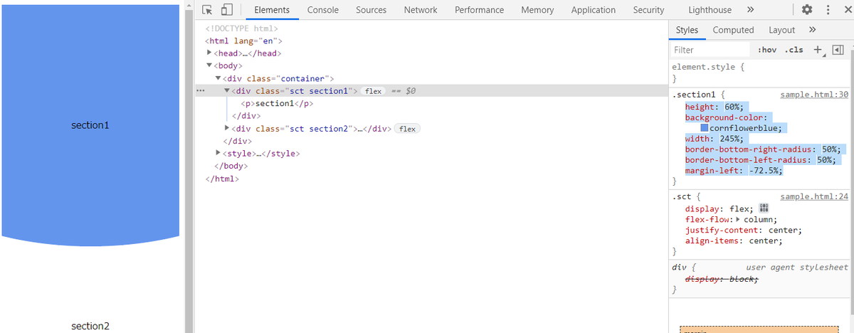
width:245% で margin-left: -72.5% を設定する。
.section1 {
    height: 60%;
    background-color: cornflowerblue;
    width: 245%;
    border-bottom-right-radius: 50%;
    border-bottom-left-radius: 50%;
    margin-left: -72.5%;
}
このように少し緩やかな弛みになります。
以上です。